Most people don’t go looking for banner ads, take out marketers, and NO ONE goes looking for banner ads. It is a very passive but still powerful medium. You can reach current customers and prospects to drive new and repeat business. A good display advertisement targeted to the right audience can drive fantastic incremental lift to any campaign. Outside of developing the right audience, banner creative is the next most important piece to your campaign. Here are five things to keep in mind when you’re creating your banners:
1. Message should be aimed at your target audience
- For example, targeting lapsed customers with a we miss you message is very appropriate. Targeting a group of prospects with the same message is a little weird.
2. Keep it simple, then make it simpler
- If you are using a banner to educate customers, you are picking the wrong medium. You have only a couple of seconds, if you are lucky, to get you message across and one of those MUST be you brand
Opportunity for improvement

Bank of America digital display ad. 1 - 2 - 3 is a nice touch, but there is a lot to get across on this message that would require the viewer to invest "effort & time" to read. Cash back, rewards, bonus, etc
Good

Nest Thermostat digital display ad. One message that the viewer can easily digest.

iTunes Radio display ad. Couple messages, but clearly translates in the hierarchal format. What, who, how
3. Don’t overdo the interactive elements
- Any of the animated or interactive elements should add to the message, not distract
4. Use white backgrounds to emphasis an element and stay away from small fonts
- Most web pages use a white background, so using this as your banner background can increase the chance of people missing it, but if it is used to emphasize an element it can work very well (unique looking product image)

Nest Protect digital display ad. Draws attention to the interesting image which also includes the brand name.
- Fonts should be 16px or larger, people will not work to read a message they weren’t seeking out to begin with, so make it bold and big
Opportunity for improvement
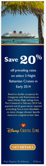
Disney Cruise Line display ad. Other than a 20% offer, there is a lot to understand in this ad. Would be interesting to see if instead of the tiny print they included more pictures of either the cruise ship or locations.
Good

Forever 21 digital display ad. Pretty straight forward offer message and sense of urgency with end date.
5. Don’t forget your logo, and yes, make it bigger
- Don’t let your logo get drowned out from the rest of the message. A majority of people won’t click on the ad itself, but they may go searching, but if they don’t know who to search for, you’ve missed an opportunity
- Also, for those with animated banners, make sure to keep your logo ever-present
Opportunity for improvement
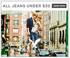
American Eagle display ad. Did you spot the brand logo? Probably not at first glance.
Good

American Eagle display ad. This one is very clear on the brand!

Sports Authority digital display ad. Very clear brand and message to get your winter gear.
Follow these guidelines and you should be in great shape to have a successful campaign. Once last piece most advertisers forget about is the post-click or for most the post-exposure experience. Where can you land customers so the experience is consistent? In the example of we miss you campaign, does the landing page include that same message? If you are promoting an offer, how can customers find that offer they saw in the ad?
Samples taken from Moat.com, a great place to view digital display ads from various brands.


 [/caption]